Studies support that we have a better chance of understanding and remembering ideas, processes and other things when they are represented in pictures. Images have greater impact than text, and many, especially those in advertising, would agree. For teachers, one of their teaching aids are multimedia and other image-supported tools to help them tackle an otherwise lengthy and complex subject. Even in PowerPoint Presentations, the trend nowadays lie on imagery more than text.

Visualize a Process
In this article, we will show how effective the use of images is when it comes to presentations, especially regarding processes. Many presenters also use diagrams and pictures to practically and effectively convey the various steps within a procedure. This significantly shortens your presentation deck while allowing your audience a more interesting time with your presentation. The Process Diagram Template for PowerPoint 2013 is a beautiful template that you can use to convey a process in a visually interesting way.
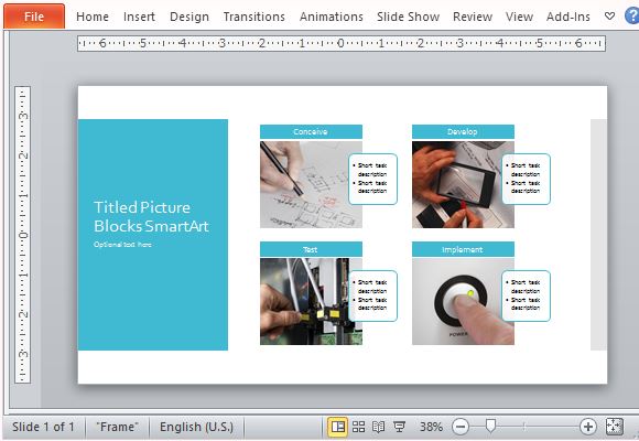
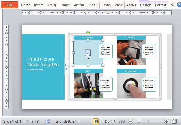
The Process Diagram Template uses SmartArt where you can see four sample images that you can exchange for your own simply by deleting each photo, clicking on the placeholder, and inserting your own image from your computer.

Clean and Light Layout
This Diagram Template for PowerPoint 2013 contains a clean layout with colors that are easy on the eyes. The colors are in light blue, as seen in the block shapes for the title and for each of the process steps. These are all within a white background to maximize readability.
Meanwhile, the title can be easily set apart from the process because of its large, bold text that still matches the rest of the slide. In the title block, you can also type any subtitles or small description.

The process diagram itself contains photo blocks that represent each step in a process, lessening the need to use long descriptive text. This template is designed to show a systematic and chronological process of just about anything. Whether it is a simple or technical process, the layout will make it look professional and uncluttered. More importantly, the images are appropriately sized so that it is still clear enough even for an audience at the farthest part of the room.

Leave a Reply