While a pie chart can be enough to present your data in visual format, you can always take this up a notch by creating a donut chart. A donut chart is also a chart that is similar to a pie chart, except that it has a hole in the middle, exactly like a donut. This allows you to separate different sections of the donut and assign values to them as you would make any other chart.

If you don’t have graphic design skills or simply want to cut your time in half, you can use this Modern Donut Chart Template for Excel. This template is perfect for creating quick and easy donut charts to include in your presentations, reports, or even for infographics done in PowerPoint.
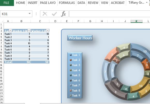
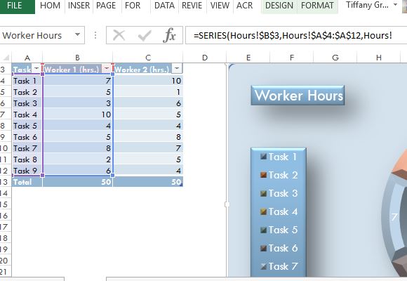
This template is free to download, and it has a very modern design that suits many presentation themes. It features a ready-made table wherein you can type in your information, which will then be automatically reflected on the donut chart. There is already sample data on the template, giving you a preview of how your very own table and donut chart would look.

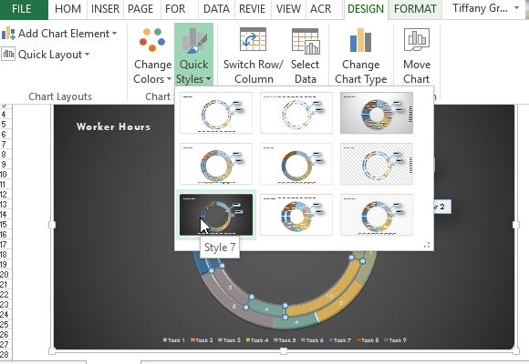
The modern donut chart itself has a beveled design that makes it appear 3D. It already has different colors that each correspond to an item in your table. The chart also has two layers, which provide you a convenient way of displaying two sets of information instead of creating two pie charts.
In the example, there are worker hours that two workers have to complete for various corresponding tasks. These sample data can be changed to your own data, such as your project members’ tasks and work hours, and many others. With such a template as this modern donut chart template, you can be sure that your data is accurately calculated and reflected on the chart, making it look professionally made, as it truly is.

You can easily customize the donut Excel template and use it to present various data for various reports and presentations.

Leave a Reply